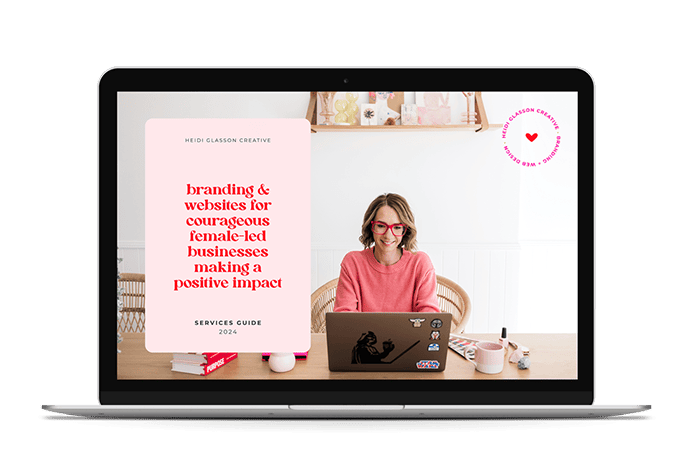
Colour is one of the most important elements of design as we use it to communicate emotion, attitude and meaning. The use of a single colour or palette of colours can evoke feelings of warmth, nostalgia, calm or excitement, and in turn affect their feelings about a brand or product. Colour can also make your brand easily and instantly recognisable (think Cadbury purple).
While each individual will view a design and/or colour through their own unique lens (made up of their own experiences, likes, dislikes, motivations etc), here are some of the ways different colours may be viewed.
Blue – Peace, tranquillity, calm, sky, ocean, cool, freedom, refreshing, intelligence, stability, trust
Red – Passion, love, energy, excitement, revolution, danger, blood, strength, power, heat, stop, anger
Yellow – Joy, happiness, energy, sunshine, optimism, hope, friendship, cowardice, spirited, prosperity, illness
Orange – Enthusiasm, balance, harmony, energy, warmth, modernity, citrus, fresh, vibrancy, autumn, flamboyant, youth
Purple – Royal, creativity, wealth, luxury, spirituality, wisdom
Green – nature, growth, harmony, go, luck, traditional, envy, environmental, safety, abundance
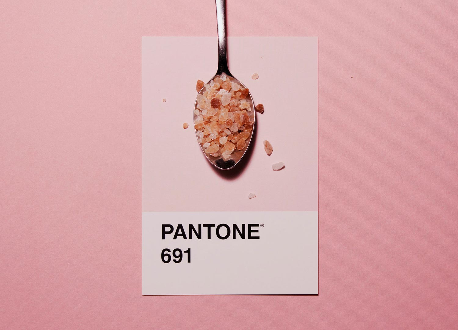
Pink – love, compassion, friendly, playful, joy, warmth, femininity, kindness, nurturing
Brown – reliability, stability, dependable, honest, comfort, nature, wholesomeness, earthy
Black – elegance, premium, confident, authoritative, formal, mourning, evil, mystery, power, depression, pessimism, strength
White – cleanliness, purity, fresh, simplicity, hope, openness, good, boring, cold, empty, innocence, clarity
So when you are looking at your brand colours, think about how you want your client to feel. Do you want them to feel a sense of calm and trust? If so, a palette of blues in harmonious tones may be the way to go. If you want them to feel excitement, a dynamic combination of reds and oranges might suit you better. Do some research and see what others in your industry are doing (and whether you think they’re doing it well!)