Graphic design is such a powerful tool to influence human emotions. Visual content affects our brains before our cognitive processes can weigh in.
There are so many visual elements to consider in your design – elements like sizing, grouping, space, shape and colour. They all work together to affect our emotional response.
Why is this important? Because great design and great branding can create an emotional connection with your audience. It makes them feel a certain way which leads to identify with your brand, trust your brand and ultimately want to spend money on your brand.
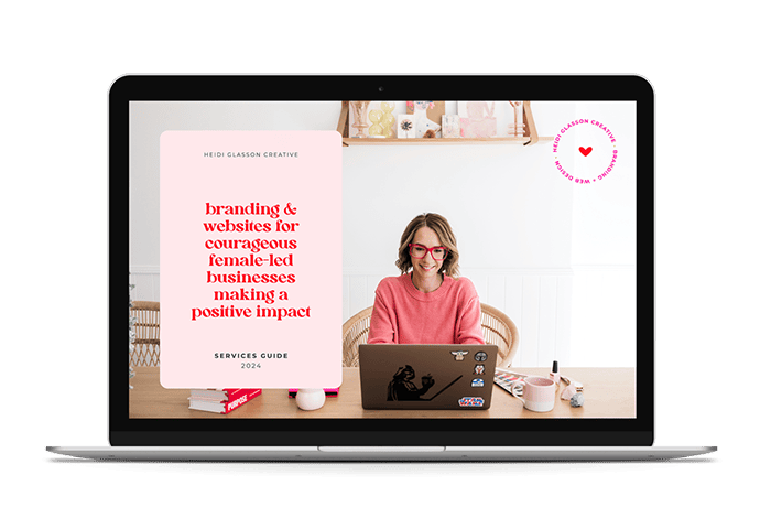
Let me show you how the combination of images, colours, fonts and other design elements ensure that you feel a certain way when you view them. Let me know which one of these is your favourite
xx